
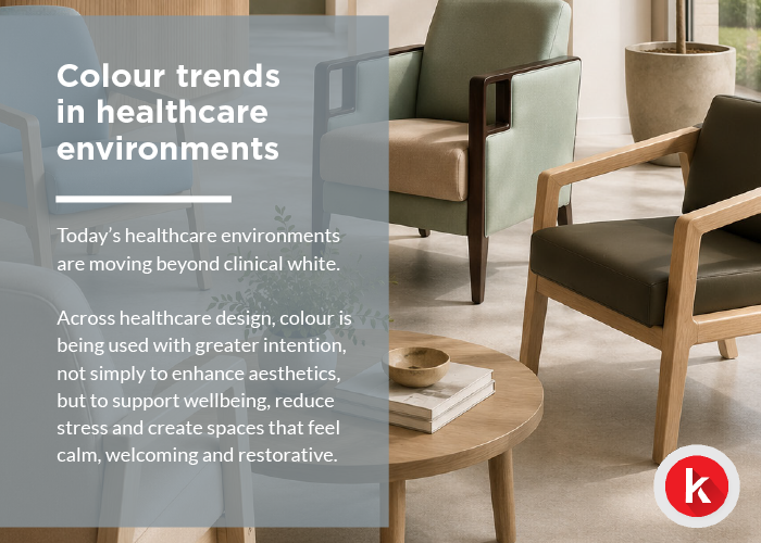
Colour trends in healthcare environments
Today’s healthcare environments are moving beyond clinical white.
Across healthcare design, colour is being used with greater intention, not simply to enhance aesthetics, but to support wellbeing, reduce stress and create spaces that feel calm, welcoming and restorative.
From waiting areas and patient rooms to staff wellbeing spaces, carefully selected colour palettes can influence how people feel, behave and experience an environment.
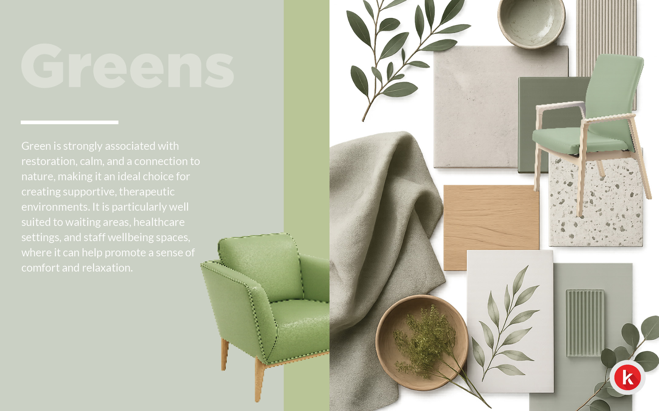
Green – bringing nature indoors
Green has long been associated with restoration, calm and a connection to nature.
In healthcare environments, these qualities help create spaces that feel reassuring and supportive, particularly where people may be experiencing stress or anxiety.
Green works especially well in:
- Waiting areas
- Specialist environments
- Staff wellbeing spaces
Whether introduced through upholstery, finishes or surrounding materials, muted greens can soften healthcare environments while creating a greater sense of comfort and relaxation.
It is a reminder that colour is not simply decorative. It can play an important role in how healthcare spaces are experienced.
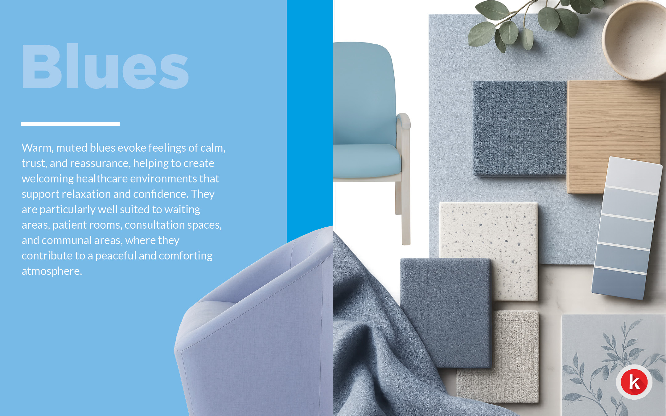
Blue – creating confidence through colour
Warm, muted blues have become an increasingly popular choice across healthcare environments.
Often associated with calm, trust and reassurance, blue helps create spaces that feel welcoming while supporting positive patient experiences.
These tones work particularly well in:
- Waiting areas
- Patient rooms
- Consultation spaces
- Communal areas
Rather than feeling cold or clinical, softer blues help reduce visual intensity and encourage a peaceful atmosphere for patients, visitors and staff alike.
When paired with natural materials and warm finishes, muted blues create environments that feel both professional and comforting.
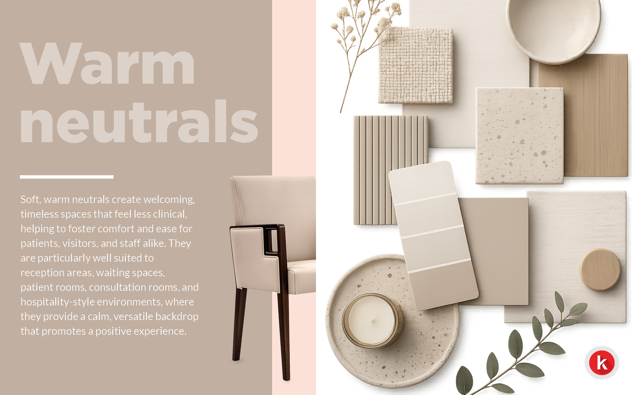
Warm Neutrals – moving beyond clinical white ?
Healthcare interiors do not always need bold colours to make an impact.
Soft, warm neutrals are increasingly replacing bright white finishes, creating environments that feel welcoming, timeless and comfortable.
These palettes are particularly suited to:
- Reception areas
- Waiting spaces
- Patient rooms
- Consultation rooms
- Hospitality-inspired healthcare environments
Warm neutrals provide a versatile backdrop that works beautifully alongside natural textures and carefully selected accent colours, helping spaces feel less institutional while maintaining a professional appearance.
Sometimes the most calming environments are created through subtle design choices.
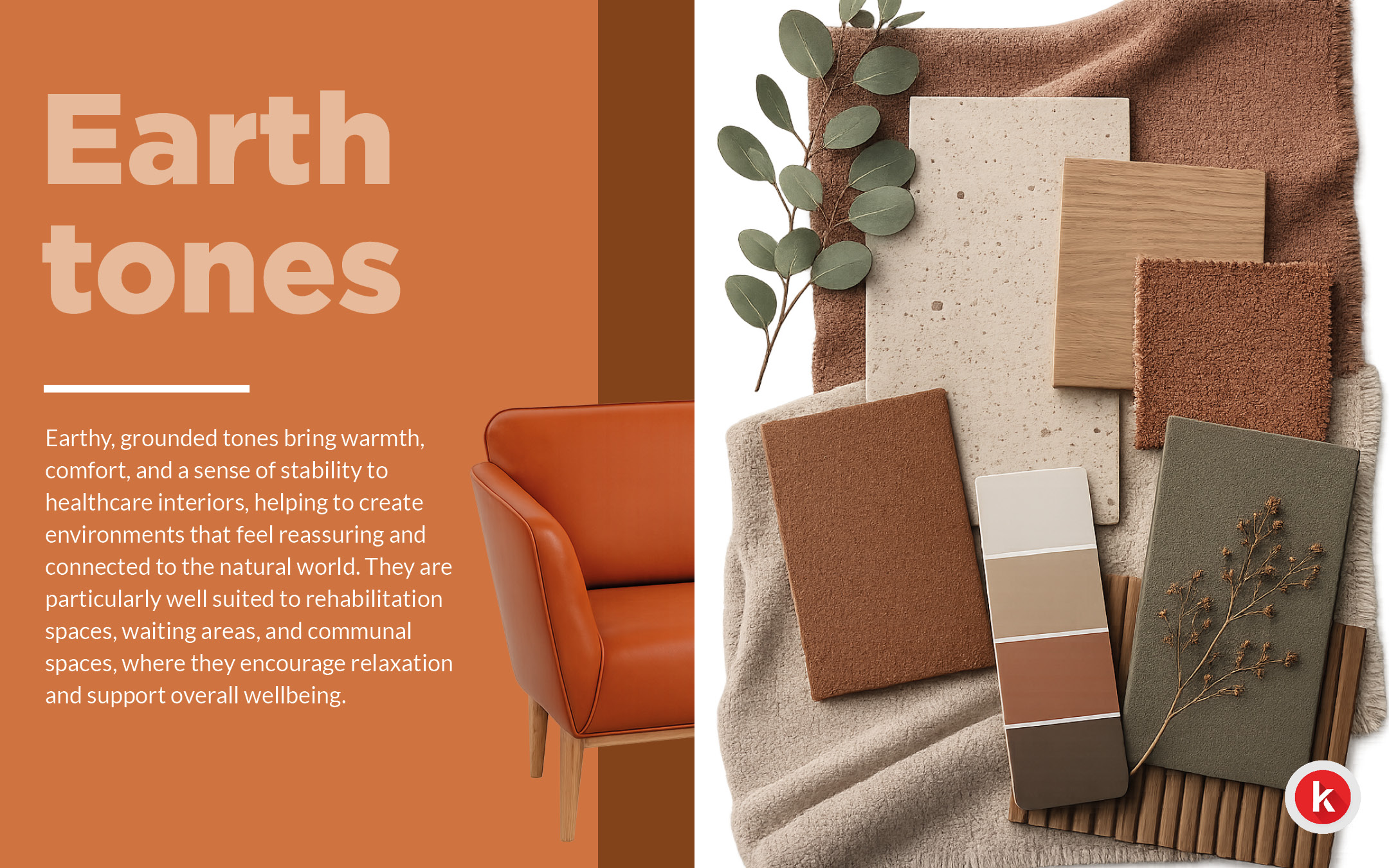
Earth Tones – warmth inspired by nature
Earth-inspired palettes continue to influence healthcare design by creating interiors that feel grounded, comforting and connected to the natural world.
Rich terracottas, muted clays, warm browns and natural ochres introduce warmth without overwhelming a space, helping create environments that feel reassuring and familiar.
Earth tones are particularly well suited to:
- Rehabilitation spaces
- Waiting areas
- Communal spaces
Combined with natural materials, these colours help soften healthcare interiors while supporting comfort and overall wellbeing.
Creating restorative environments is often about the finer details, and colour remains one of the most effective design tools available.
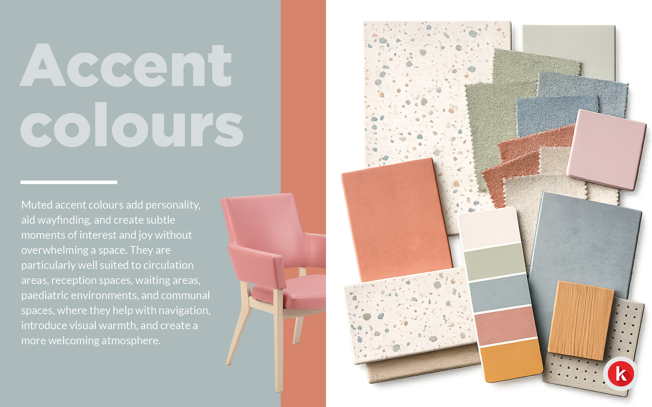
Muted Accent Colours – subtle colour with purpose
Not every healthcare space needs to rely solely on neutral tones.
Muted accent colours introduce personality, support wayfinding and create subtle moments of interest while maintaining a calm and welcoming environment.
They are particularly effective in:
- Reception spaces
- Waiting areas
- Circulation routes
- Paediatric environments
- Communal spaces
Used thoughtfully, these softer accent colours help break up larger spaces, improve navigation and make environments feel more approachable without becoming visually overwhelming.
As we’ve explored throughout this series, colour is no longer simply a finishing touch. It has become an important part of creating healthcare environments that support the wellbeing of patients, visitors and staff alike.
If you have a project you need help with? Or a product enquiry do reach out to us.
Comments are closed here.